Module 2: The Elements of User Experience
Further to my notes about the module 1 of the free online course ‘User Experience for the Web’, here are some notes about its module 2: The Elements of User Experience.
As for module 1, here is a quiz with 10 questions related to module 2.
And if you read all this post, you get another bonus…
Topic 1: Designing interfaces
The interface is basically what sits between you, the user, and a product.
By example, a microwave has an interface: it has buttons, dials, door handle. And that is how you interact with the product.
Three core design elements impact your interface:
- Information design: elements that you need to put together
- Interaction design: things you interact with to make those elements work
- Visual design: where architect and designers decide on the look and feel of the product
Here is an example with a website:
- information design is all about the content, pieces of information how they are grouped together, how the user will go about understanding the relationships between information
- interaction design is how the user actually accesses that piece of information: are they clicking on buttons? are they scrolling? how are they navigating to get to that information?
- visual design is where the interaction and information design are brought together to create the final look and feel for the website
Topic 2: Information Design
Example of a website: information design relates to the words, the paragraphs, the headings that are used on that site, the button labels that are used, the menus, and how the user navigates and accesses the information, how information is grouped together.
So, for a website, information design is all about the:
- the logical grouping of information
- how users think about the information and the groupings
- the flow of information
- the goal being to help user digest and find information more easily
Example of a house: imagine oven in a bedroom, sink in the living-room, fridge in the bathroom. Cooking would be very difficult…
=> That is the importance of information design: it is all about making sure things are logically grouped together.
Techniques:
- card sorting
- information architecture validation
- content mapping
- content audit
Topic 3: Information Design technique: Open card sorting
Card sorting is an information design technique.
Example of a website visited by thousands or millions of people everyday. How to solve the dilemma of grouping the information that makes the most sense to all of them?
Card sorting can help:
- Use a card for every item you want to sort / qualify
- Invite users to group these items in a way that makes sense to them
- Then, users give a label to each group they have done
- By doing this several times with different users, patterns (in terms of how information is grouped together) are emerging
Card sorting is not the answer to information architecture, this is just one input.
Strengths:
- cheap, easy to conduct
- users get it, so they know what they have to do with the exercise
Weaknesses:
- analysis can be quite difficult
- it is not going to give all the answers, this is just an input
Topic 4: Interaction Design
Interaction design is about deciding how users interact with content and features existing on a website.
Example of a common feature: selecting a date.
There are plenty of ways to implement this feature:
- typing in a textfield the numbers followed by hashes
- rolling in a drop-down list
- clicking on a tiny picture of a calendar pops up a calendar where users can navigate to months and dates and years
- etc.
=> They are all examples of interactions design that do the same thing.
4 techniques to perform interaction design:
- desktop research: look at what others are doing and thing about re-appropriating that kind of functionality if it suits to your website
- brainstorming
- collaboration
- low and / or high fidelity wireframing
Topic 5: Interaction Design technique: Low fidelity wireframing
Low fidelity wireframing = mockups or wireframes.
It is a way of getting your designs down early.
During the design phase, as an architect, first you want to start putting some concepts down on paper. Here is an example:
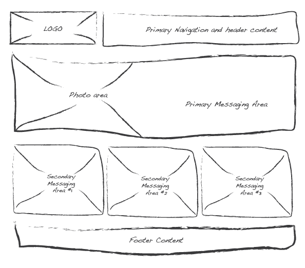
It’s crude, unresolved, and it is all about just getting concepts down. It is about deciding things like the features, the information that you think the users would want to know, the layout.
There are number of ways you can go about producing a mockup. Besides paper and pen, there are many software tools helping draw mockups.
The benefit of doing something rough is not being attached to the design, this is more likely you can go and make changes.
Strengths (of producing low-fi wireframes and mockups):
- cheap
- quick to produce
- opportunity to get feedback early and often
Weaknesses:
- client might not fully understand it. So you might spend more time explaining the design
Topic 6: Visual Design
This is the third phase of the design process, where everything comes to life and determines the look and feel of your website.
There are several reasons to conduct visual design in a project:
- to bring interaction design and information design together
- to provide visual cues: because mockups do not have any colours (they are black and white). Colours help users notice certain features and functionalities, such as a button on the design
- to create a mood and experience
- to consider usability
- to get sign off: visual design is the last design phase where the client gets to really see what the website is going to look like
Visual design allows to modify the prototypes / wireframes that have been done previously.
About some techniques:
- conceptualisation
- mood boards = exploring the mood of stakeholders (who want something “fresh”, “new”, “original”)
- style guide = producing a document that outlines every style that is used on every feature of the design
- Example: a button with 3 stages (default, clicked, hovered)
- pattern libraries = helping the developers who code the website to better understand the pattern
- Example: a “list” will always look like “this”, a “carousel” behaves like “this”, every time icons appear like “this”, etc.
Topic 7: Visual Design technique: Conceptualization
Before you get started with the conceptualization technique, there are few things you need:
- the visual design brief is really important. This is a document that outlines what the stakeholders imagine and envisage to be the look and feel for the website
- software tools: a tool to be able to produce the artefacts
- doing some desktop research, to better understand what’s going out there, what common trends are happening?
- understanding your users goals and business goals
- getting wireframes to help you to put the final touches on the visual design
=> The whole idea behind conceptualization is to produce two, three of four distinctly different concepts to take back to your stakeholders. So they can compare and decide.
What usually happens is that stakeholders wipe out one of the concepts, and want a “hybrid” of two of the other ones. This is still ok, because it gives direction.
Topic 8: User Experience and branding
For this topic, consider “brand” more than a logo or a symbol. A brand of an organisation is actually a perception that the consumer or the end-user has about that organisation, based on all the things that they interact with that come from that organisation.
Example with a smartphone, the “brand” is:
- the physical product
- the store to buy it
- the advertising
- the website
- the peopole or the staff within in that organisation that the consumer interacts with when they have a problem
- the logo
=> The brand is all about perception.
What do we mean by perception?
- A consumer ‘A’ might have a positive perception of that smartphone organisation: he really likes the phone, the customer staff have been very friendly
- A consumer ‘B’ might a totally different perception of that same company: the phone broke down, he gets issues when trying to get a refund
=> Perception is individual.
As a specific element of a brand, the website has to be aligned with the brand’s message, because it impacts how a user perceives the brand, the company. Three elements of the website impact the brand:
- the visuals
- the tone of voice, the language used
- content
To design a website that successfully aligns with an organisation’s brand, you need 3 key things:
- the branding guidelines of the organization, typically owned by marketing
- the visual design style guide, owned by the online / digital team
- having a good understanding of the target market (= the end-users for the website)
Topic 9: Accessibility and inclusive design
Accessibility is about the degree to which a system is usable and accessible by as many people as possible. It is fundamental to good design.
Accessibility is not about people with disabilities: it is about access requirements. Imagine end-users:
- need to wear glasses to see small text
- cannot speak English very well, so find hard to understand some websites
- do not have or use headsets on: if they try to view some audio content, there is no transcript
- have access issue because of a low or very poor Internet access
Specifically talking about disability, it can be
- temporary or permanent
- physical or cognitive
Why would you want to make your website as accessible as possible? One relevant reason is that it could be legal. Walt Disney, Target and the Sydney 2000 Olympic website paid massive damages further to lawsuits started by groups of blind people.
How does a blind person access a website? By using:
- a screen reader. This software installed on the computer reads the words on the screen
- a screen magnifier. This software zoom the website to quite a large amount, and the user can easily see the words on the screen
- a Braille machine. There are some devices that connect to a computer and as the user navigates through the website, the words are read out and the Braille machine kicks in and the person can use their fingers to actually read the website
=> All UXs or user experience practitioners should include accessibility as part of their design challenge.
Topic 10: UX in traditional development cycles
Where User Experience fits within other processes to deliver a website? Because UX is just one factor of a typical process, that combines: hardware, software, development, stakeholders, project management, etc.
User Experience does not always come at the start, it is often factored in sometime after the project has started. So it is really important to ensure user experience can fit appropriately within that process, and is not the bottleneck.
Instead, if UX works correctly, it should help speed up the process so you can have an effective design much faster.
The Forrester company, a very large research organisation, did some research into the cost of running a user experience as part of a project. And they find:
- when UX is brought in early, the cost is as much as it would cost to actually do the design. So it is a “one-to-one”
- when the design is ready and the website ready to be launched, the costs go up by 10
- It means that it costs 10 times as much to come back and resolve some of the design issues.
- when the website is launched, the cost go up by 100, meaning that it costs a hundred times as much to redesign the website compared to having done the user experience up front.
=> It is really important to consider introducing User Experience and its methodologies as early as possible in the software / website development cycle.
Reminder: there is a quiz with 10 questions to test your knowledge.
And if you feel really comfortable with these first topics, perform the 10 questions assessment for module 1.
Feel free also to have a look at these other posts:
- Online course ‘User Experience for the Web’ – module 1 – Overview of User Experience
- Online course ‘User Experience for the Web’ – module 3 – Knowing your users
- Online course ‘User Experience for the Web’ – module 4 – Usability Evaluation Techniques
3 thoughts on “Online course ‘User Experience for the Web’ – module 2”